Carl Cervone
Joyplotting Coffee and Altitude
August 5, 2021
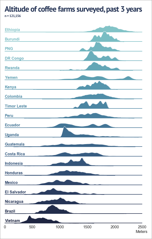
A visualization of the altitude of 121,156 coffee farms visited by Enveritas over the last 3 years, representing 21 countries.
There are three things that were fun about making this dataviz.
- It’s a joyplot (😂📊). According to this blog, a “joyplot” refers to the classic 1979 Joy Division “Unknown Pleasures” album cover, which in turn was an interpretation an image originally published in Scientific American in 1971. The image in question is a stacked plot of the radio emissions given out by a pulsar.
- The relationship between coffee and altitude is fascinating. Altitude is essentially a proxy for climate. Coffee trees grow best in mild, tropical climates. They can’t survive frost — this puts an upper limit on the altitude in each growing region. They don’t like too much heat, either. The ideal range for Arabica trees is roughly 13 to 27 C (55 to 80 F). IMHO, this is the ideal range for humans too. There tends to be a positive correlation between altitude and quality (all other factors, like processing and varietal, being equal).
- The differences between countries are also really interesting. Countries like Guatemala, Costa Rica and Peru have coffee farms at a large range of altitudes. The distribution is much tighter in places like Brazil and Kenya. The average altitudes in East Africa (and PNG) are significantly higher than most of Latin America.
This plot was created by taking a simple dataframe containing a row for each countries + farm altitude observation, and mapping the kernel density estimates onto a FacetGrid with Seaborn. (Here’s a helpful post from StackOverflow.)
import pandas as pd
import matplotlib.pyplot as plt
import seaborn as sns

# Initialize a FacetGrid object and color palette

g = sns.FacetGrid(
		df,
		row="Country",
		hue="Country",
		aspect=15,
		height=.75,
		palette=sns.cubehelix_palette(
				len(df['Country'].unique()),
				rot=-.25,
				light=.7
		),
		xlim=[0,2500]
)

# Draw the kernel density estimates (KDEs)
g.map(sns.kdeplot, "Altitude", bw_adjust=.33, clip_on=False, lw=1.5, fill=True, alpha=1)
g.map(sns.kdeplot, "Altitude", bw_adjust=.33, clip_on=False, lw=1.0, color="white")
g.map(plt.axhline, y=0, lw=2.0, clip_on=False)

# Define and use a simple function to label the plot in axes coordinates
def label(x, color, label):
    ax = plt.gca()
    ax.text(0, .2, label, fontweight="bold", fontsize=16, color=color, ha="left", va="center", transform=ax.transAxes)
g.map(label, "Altitude")

# Set the subplots to overlap
g.fig.subplots_adjust(hspace=-.15)

# Format axes
g.set_titles("")
g.set(yticks=[])
g.set_xticklabels(fontsize=16)
g.set_xlabels("Altitude (meters)", fontsize=18, fontweight="bold")
g.despine(bottom=True, left=True)
👇
A few footnotes and fine print. This is just a dataviz. It isn’t a complete picture of altitude distribution for the coffee world. The plots shown for each country are not representative of all coffee that could be growing in a country. The sample size for some countries (e.g., Uganda) is very large and highly representative and for other countries (e.g., DR Congo) it is small and less representative. Both Arabica and Robusta farms appear on this chart, but note that, apart from Uganda and Vietnam, virtually all farms shown here are Arabica farms.